In 2014, roughly 40 percent of all global digital content was stored in Western Digital hard disks. However, the Achilles’ heel of this $20B hardware juggernaut was their ability to deliver great software experiences. This situation became more apparent as WD competitors shifted from pure hardware players to formidable design-led organizations like Google, Apple, or Amazon. Although WD –with its flagship My Cloud™– was the market leader of personal cloud solutions, they found themselves competing against cloud storage solutions such as iCloud and Google Drive in a very disadvantageous way. When I joined WD, the long-obsolete Flash/Macromedia platform actually ran the product that my team was charted to redesign. Francis Kim, who had been hired to revamp the UX organization, asked me to join forces with him, lead the interaction design team, and raise the bar on mobile design standards.
The Hard Disk Company Moves to the Cloud
Navigating an ocean of hardware limitations
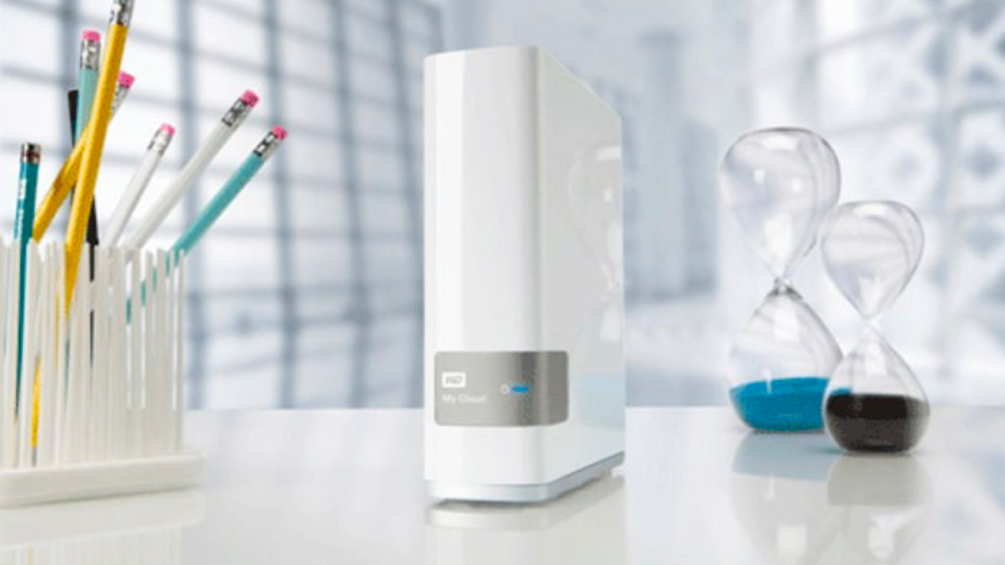
In my first week, Eric B. –head of the back-end Engineering team– summarized the essence of the design challenge: “The problem is that My Cloud™ is essentially a Linux box powered by an ARM processor.” With those words of advice, he wanted to make sure that before my team committed to any design solution, he knew way in advance what new APIs had to be created. His team wasn’t going to be able to leverage many libraries and out-of-box APIs –like android developers typically do. That meant that close collaboration would be the critical success factor in redesigning My Cloud™ software – a project codenamed webfiles.
The design-technology partnership was excellent: during the discovery phase, hundreds of hand-drawn storyboards and diagrams were used to identify the opportunities/potential pitfalls of the future solution. In addition, I institutionalized a weekly design review for the design team to get immediate feedback from the different product/development teams. In all meetings, the two recursive questions were: Do we have the APIs necessary to deliver this experience? If not, how soon can we have them?
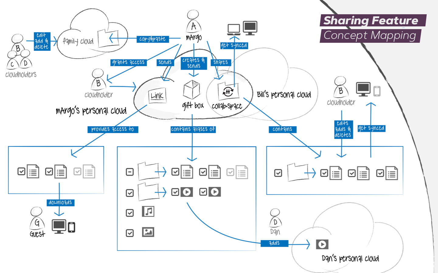
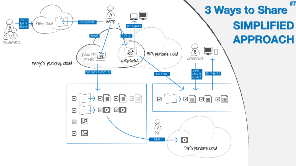
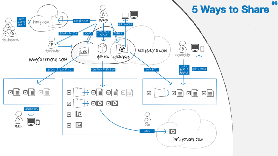
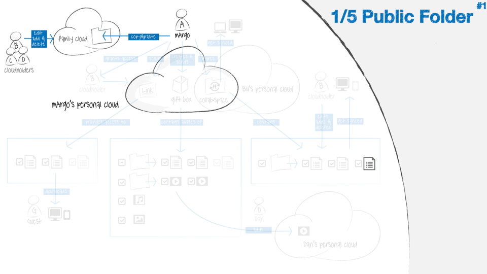
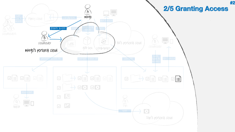
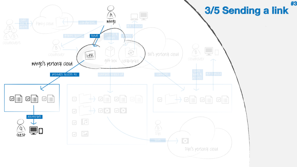
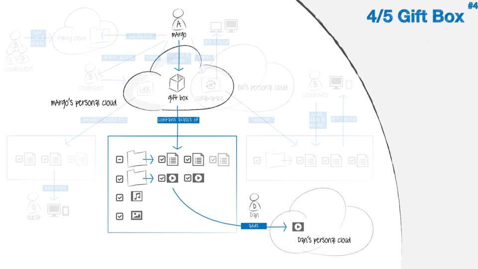
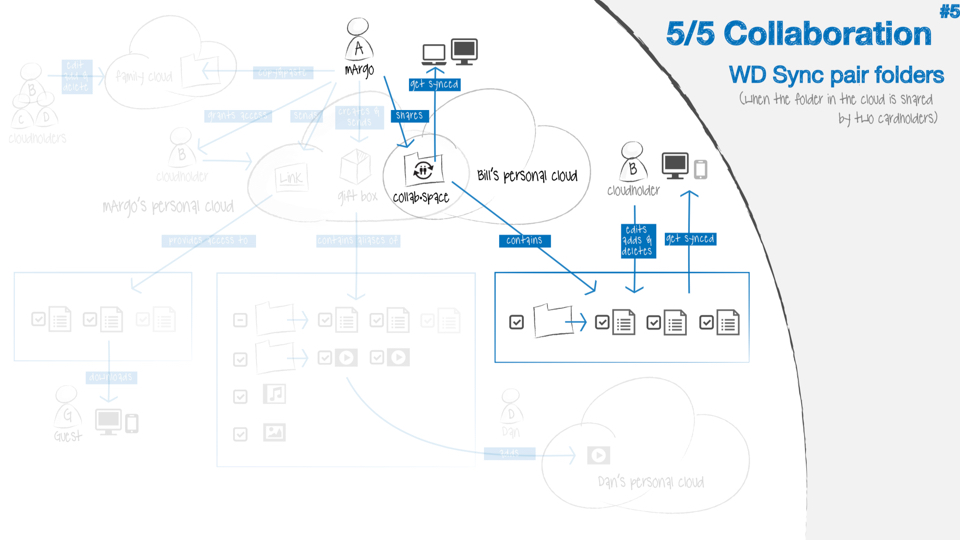
A perfect example of the collaborative nature of the design process was the concept mapping of the sharing functionality. The first diagram (below) illustrates the initial proposal –done without any design input– to allow users to share any content, from files to hard-disk partitions. These sketches were used in meetings to illustrate how confusingly similar –almost duplicative– these five features would have eventually become if they had been built. Thanks to the bright and analytical design skills of Burlington W., the architecture team finally agreed to merge and simplify the end solution in just three ways (see slide #7). When the project concluded, Raja Batra, head of the Engineering organization, came to me to congratulate the design team for having “simplified the architecture.” I take those words as great and sincere compliments because design is not about pretty pictures. It is about achieving simplicity. As Steve Jobs used to say, design is about how something works, not just how it looks.
Testing, testing, testing…
In retrospect, another key reason for the successful redesign of WD My Cloud™ was hiring Raja J. from the Microsoft team as design research manager. With his help –and two additional external researchers from UserZoom– my team was able to conduct at least one study every week. Raja eventually set up a physical usability lab, but the most impactful tests were the ones that we would launch via UserZoom. Nothing like its agility and versatility. Hard to believe now, but at the time, the Linux jargon thoroughly permeated the customer-facing language of the product. For instance, the different users in a household would be asked –as part of the onboarding process– to set up shares (Linux partitions). It took us just one research study to quantify that user-friendlier language such as “set up your personal cloud” resulted in much better engagement and customer satisfaction scores.
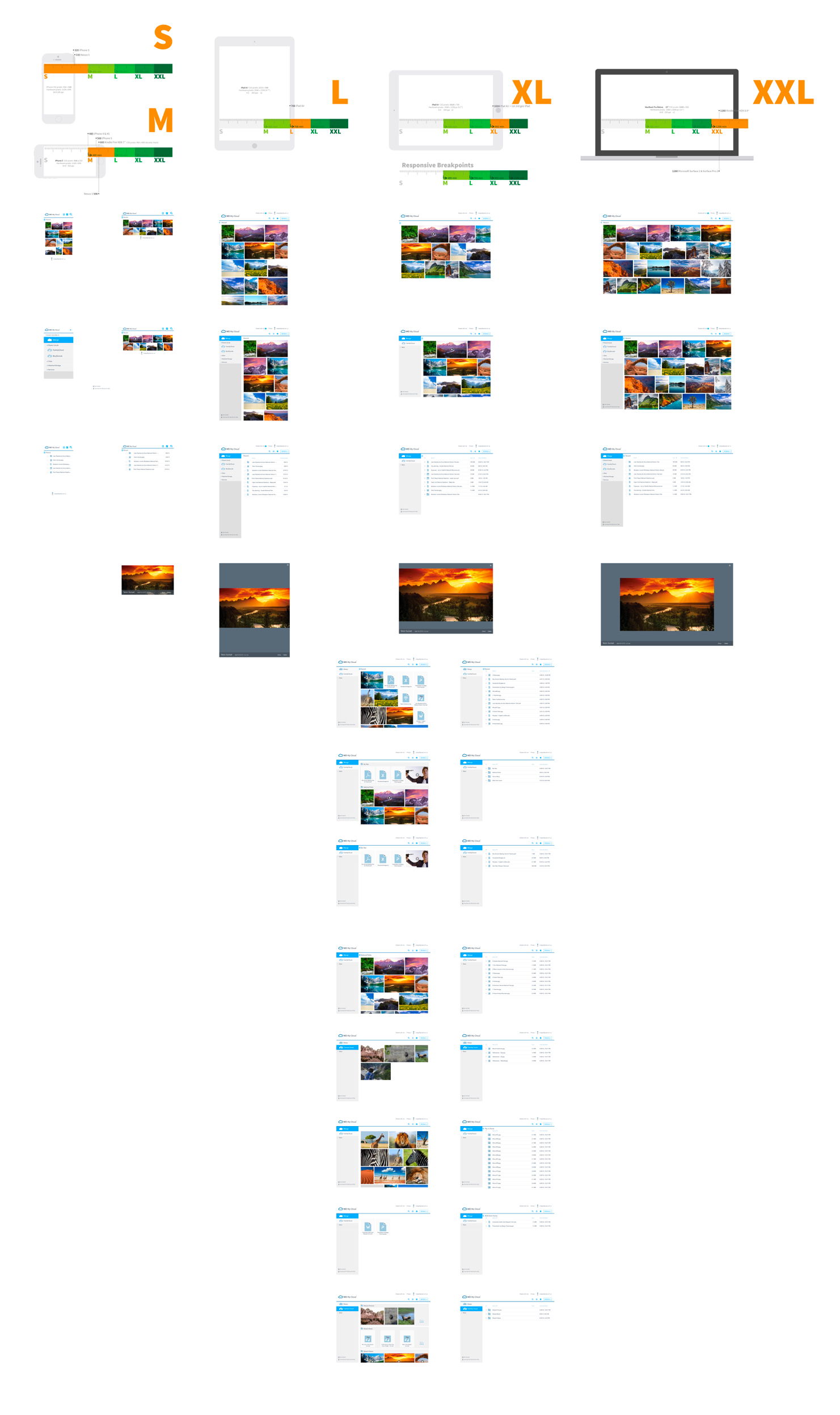
Organizationally speaking, the interaction design team became highly efficient because of its streamlined use of research, prototyping tools like Framer, the extensive reuse of design patterns, and its new design language. As a result, everyone could translate high-level business requirements into conceptual storyboards, and –in the end– deliver extremely accurate hi-fi comps to the development team in the most seamless way.
Another critical success factor was the acquisition of Trovebox, an excellent digital photo sharing and management platform by Jaisen Mathai. Thanks to him and the phenomenal codebase that we suddenly were able to leverage, we quickly created beautiful and complex masonry layouts before the advent of CSS flexbox. Before the sunsetting of Trovebox, its unique feature set –like the ability to connect multiple cloud storage services like Dropbox, Box, Amazon S3– was second to none. It was truly a privilege working shoulder to shoulder with Jaisen.
Ecosystem Design
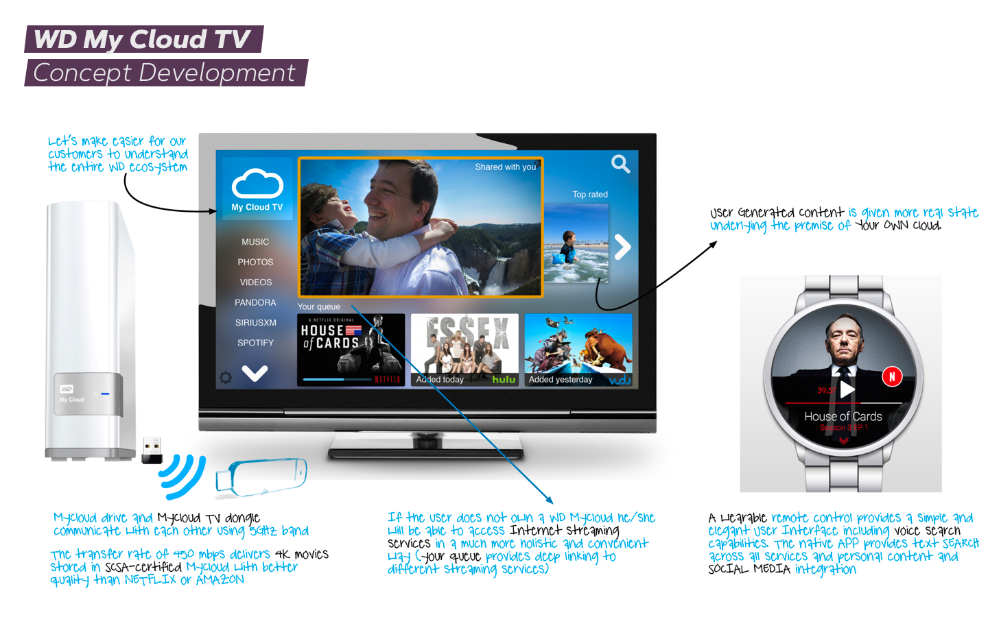
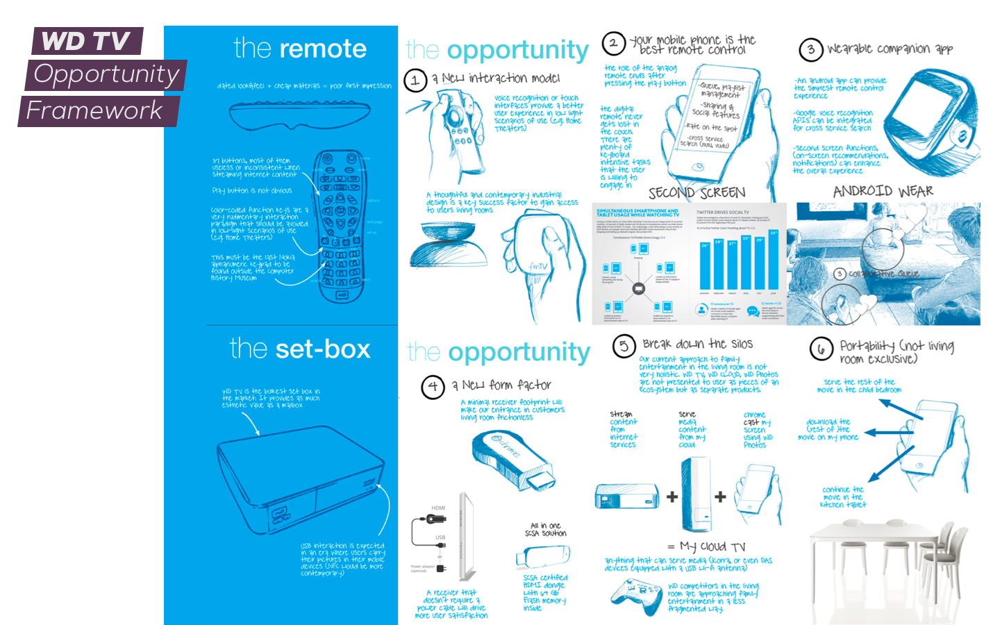
While nurturing a vibrant culture of design-driven innovation, my team explored the opportunity to transform the WD TV™ Media Player into My Cloud™ TV, an entertainment ecosystem that aspired to integrate a variety of existing WD products and services. Our vision was to tear down the hardware siloes to allow shared content to flow freely within a household. For instance, My Cloud™ drives would communicate with My Cloud™ TV dongle –which didn’t exist at the time–, to transfer and render 4K movies with better quality than Netflix or Amazon. In addition, every family member would backup their phone in their own private cloud (aka share, partition). Some of those photos would surface on My Cloud™ TV as family memories. They would be able to use their android watches –the only wearable available at the time– to rate new content, be notified of the latest greatest addition to their collective archive of memories, or simply use it as a remote control. The design strategy included using voice commands to interact and search for the content stored in multiple WD devices. Unfortunately, My Cloud™ TV was a short-lived project, and the product was eventually discontinued in 2016. But, interestingly enough, I ended up materializing some of those concepts in my next company, TiVo.
Conclusion
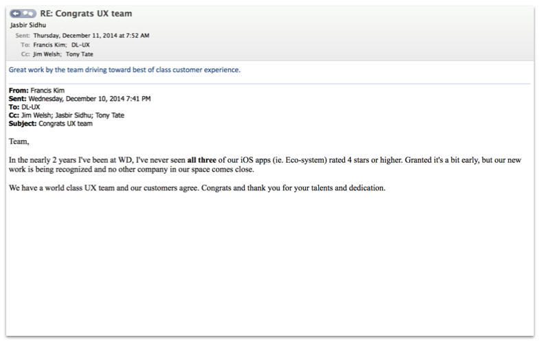
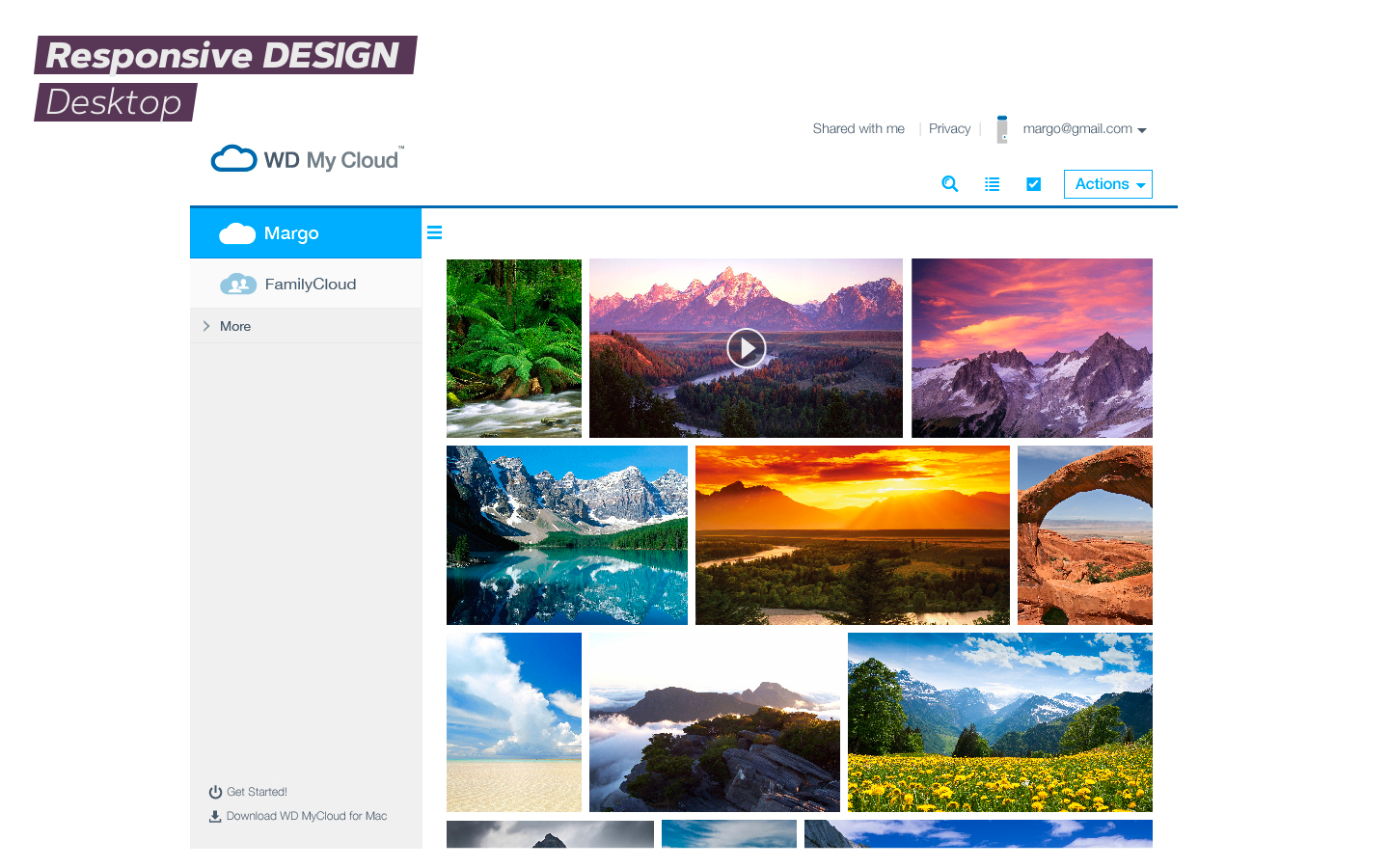
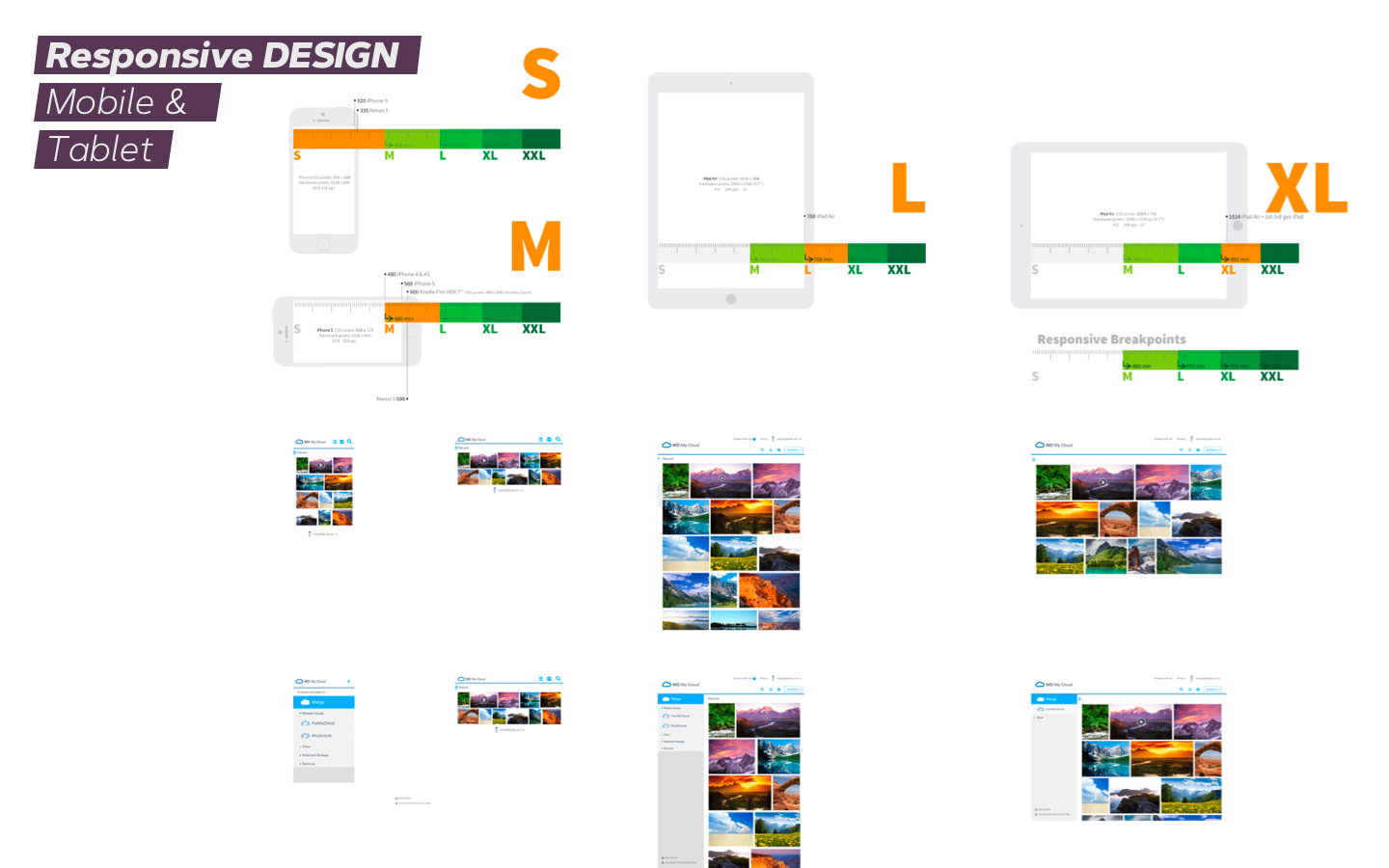
When UserZoom independently benchmarked the new redesigned interface for My Cloud™, it proved to be the easiest-to-use –with a SUS score of 86– compared to Dropbox, OneDrive, and Google Drive (scoring 82, 78, 74, respectively). When WD deployed “webfiles” to the cloud, their users enjoyed for the first time a top-notch responsive web design that worked in every browser, any device, in any orientation. My team worked on many other projects (e.g., “Kuora,” the software of the next-gen version of WD My Passport). Eventually, all those contributions resulted in all three iOS apps getting a 4 star rating for the first time in the company’s history.
